
Case /
Nemuru
Designing a Scalable Multi-Brand Fintech Platform
Client
Nemuru
Role
UI/UX Designer
Tags
UX, UI, Product Design, Design System, SaaS, Admin Panel
Duration
2020 - 2022
Overview
Nemuru, a Fintech company in the lending space, needed a consistent and scalable Design System to power its growing B2C product suite — including a consumer-facing app and an internal admin panel. The system also needed to support white-label theming for banks and large brand clients like Iberia and Tesla.
Outcomes
Enabled scalable product development
Designed a white-label design system allowing multiple partners to customise branding while maintaining a shared product framework.
Financing infrastructure embedded into checkout flows
Designed payment widgets integrated into retailer checkout experiences, enabling businesses to offer split-payment financing to customers.
Supported platform growth and partnerships
Contributed to the product experience of a fintech platform that partnered with major banks and companies in Spain, including Iberia · Tesla · Ávoris · CaixaBank.
Goals & UX Drivers
Nemuru required a scalable product foundation to support a growing fintech platform and multiple partners.
The challenge was not only to improve UI consistency, but to design a system capable of supporting different brands, financial products, and evolving business needs.
Build a robust and reusable design system from scratch
Enable branding flexibility for white-label clients
Improve UI consistency and clarity across touchpoints
Support scalable product development across B2B and B2C applications
Establish a shared foundation between design and engineering
Key Outcome
Enabled scalable product development
Designed a white-label system allowing partners to customise branding while maintaining a shared product framework.


Research & Product Considerations
Collaborated with internal teams and external partners to understand product and business requirements
Prioritised accessibility, clarity, and trust — critical factors in fintech experiences
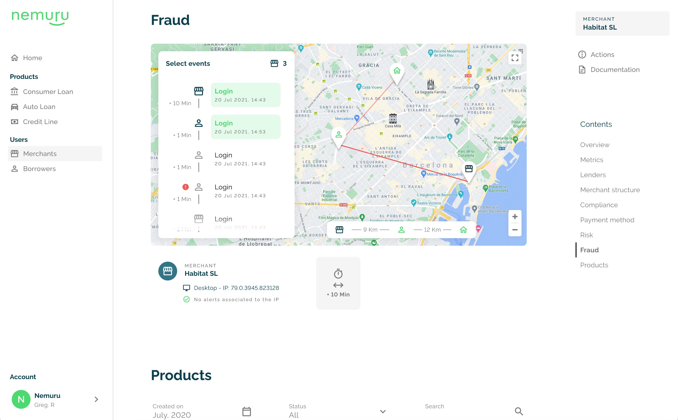
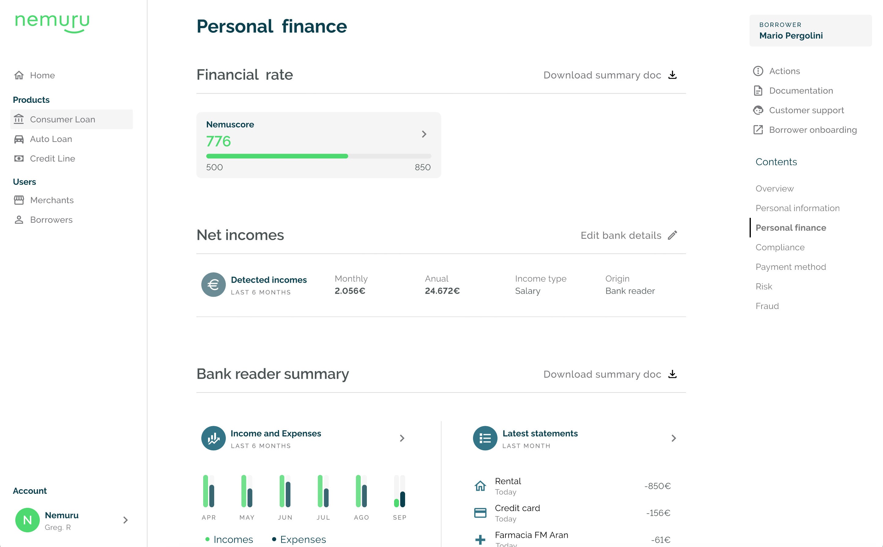
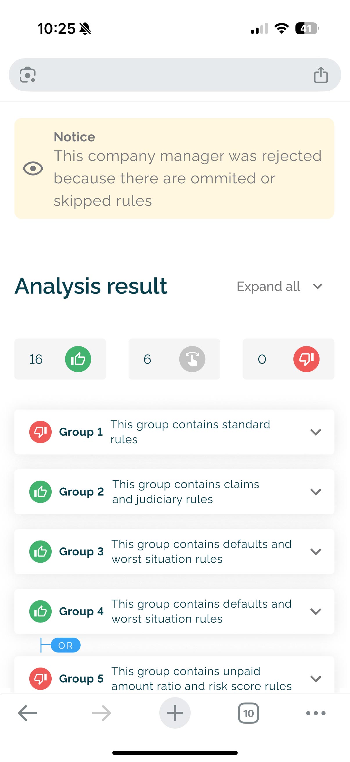
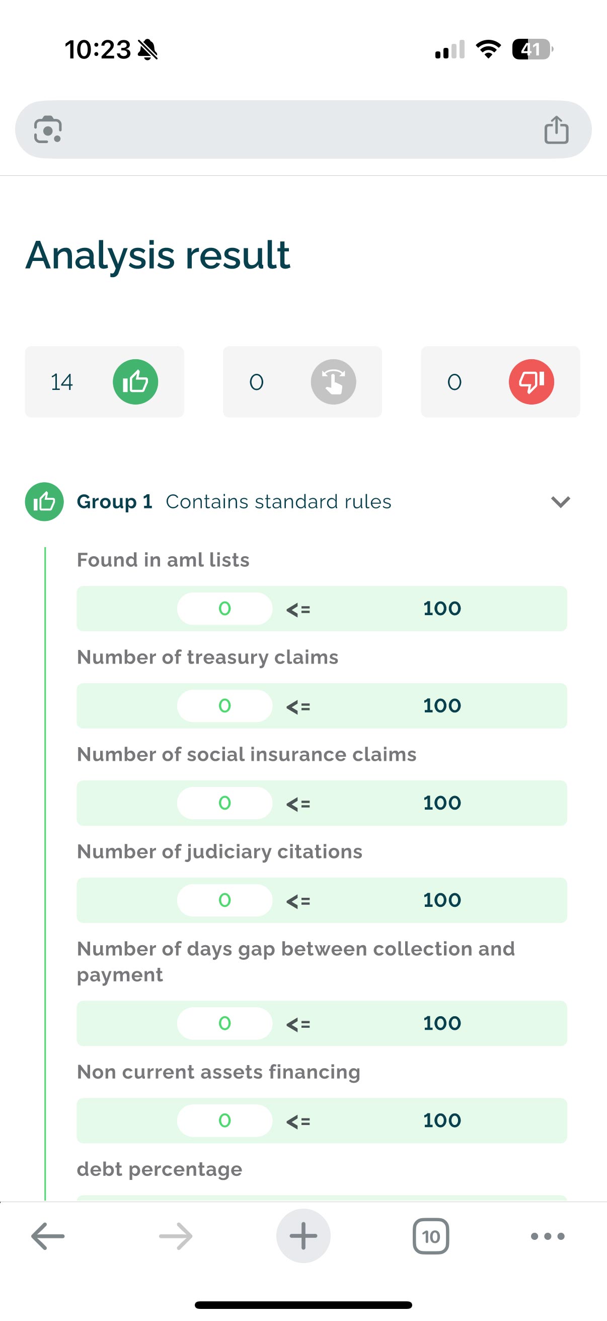
Focused on scenarios such as loan applications, financial states, and error handling
System Architecture & UI Design
We approached the design system as a product, not just a UI library.
Defined core foundations: color tokens, spacing, typography, elevation
Structured components from atomic elements to complex patterns
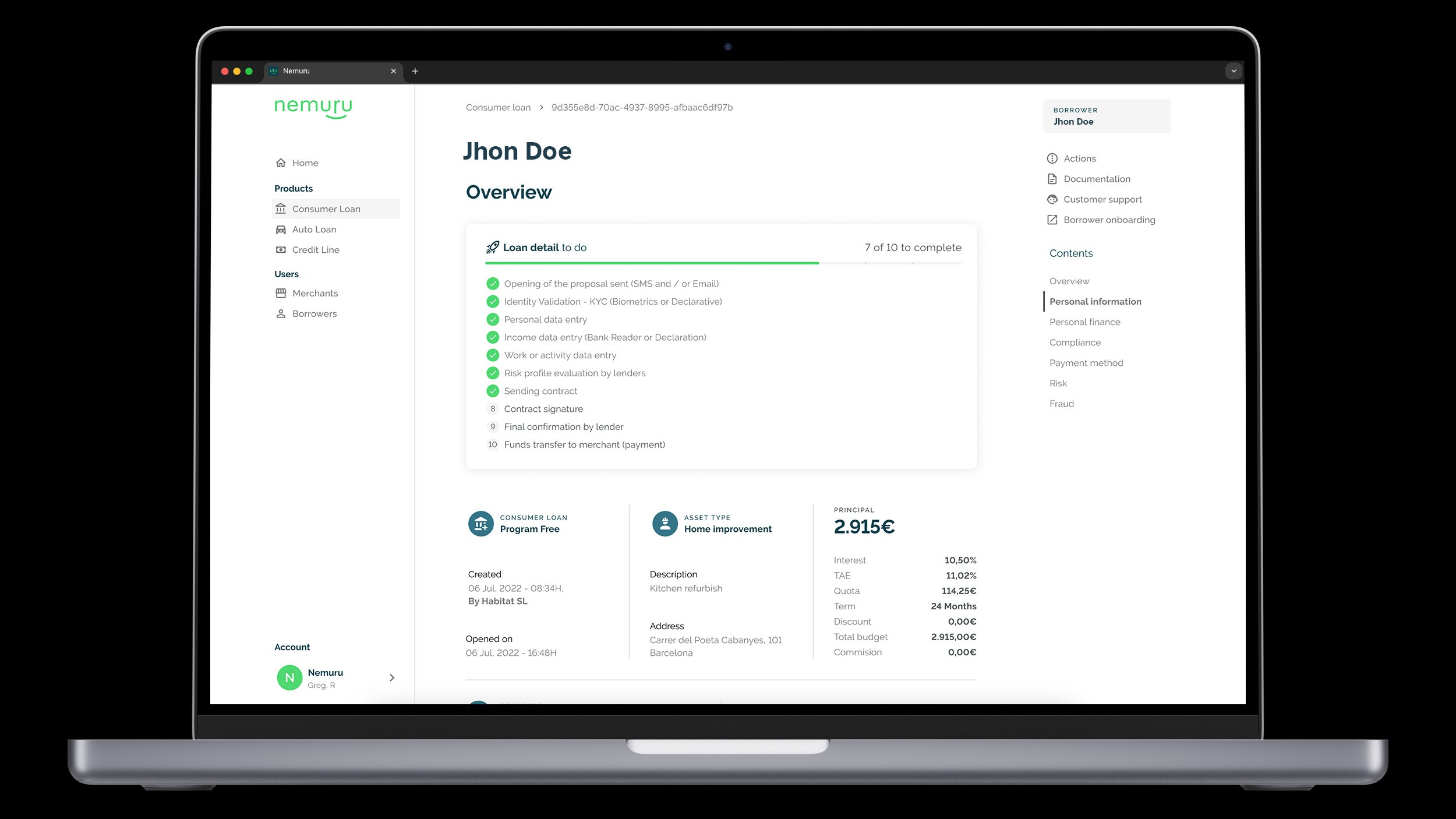
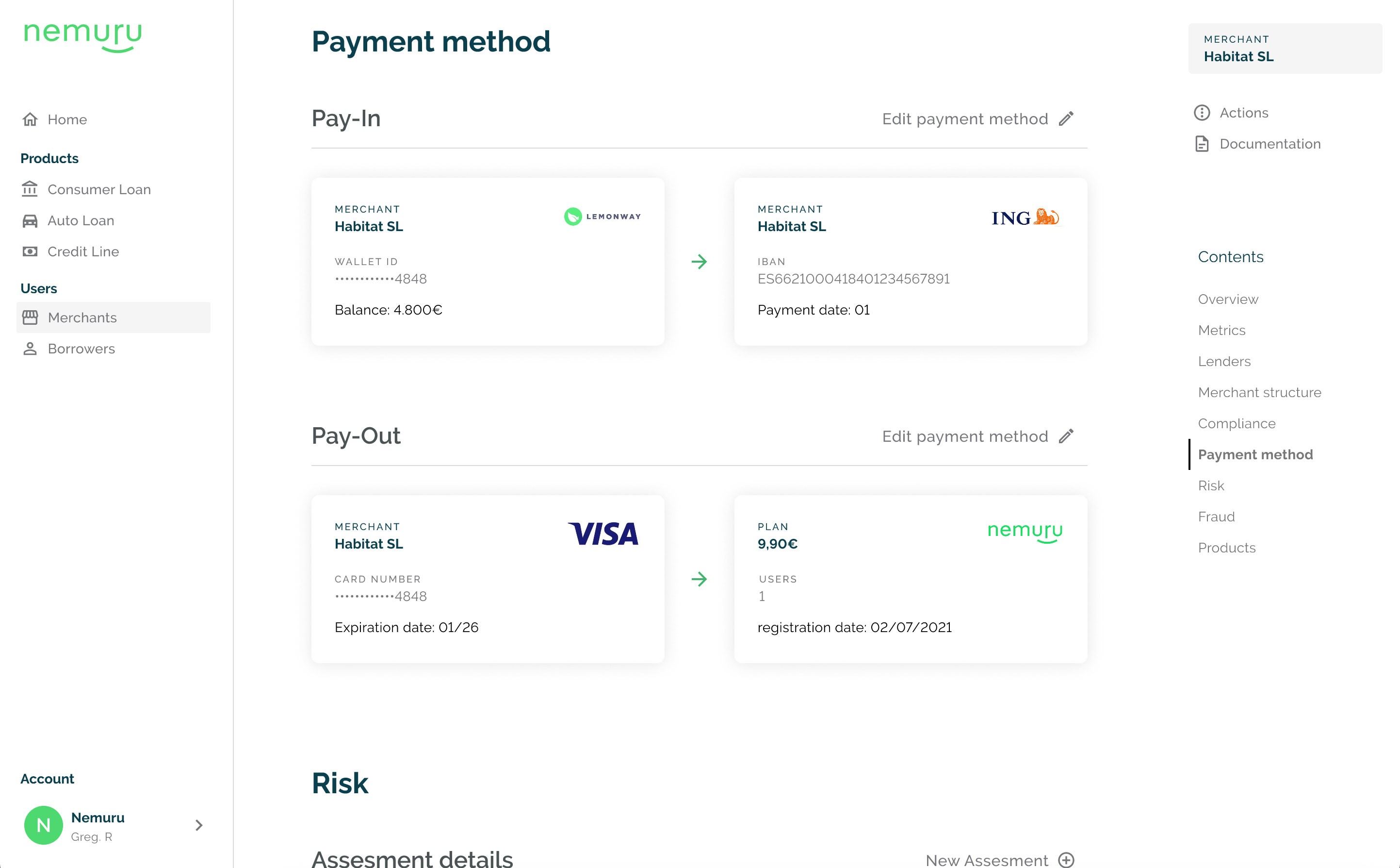
Designed reusable patterns for key fintech flows (loan applications, dashboards, status tracking)
Enabled white-label overrides through a clear theming layer
Collaboration & Delivery
Worked closely with developers to ensure design-to-code alignment via Storybook
Created documentation and usage guidelines in Figma to support team adoption
Iterated with product and engineering teams on edge cases and responsive behaviours


Design System & Scalability
Designed a modular, token-based design system to support a white-label fintech platform across multiple products and partners.
Foundations
Defined the core system using primitives and semantic tokens to ensure:
scalable theming across brands
consistency across B2B and B2C applications
flexibility for future product extensions
Component System
Built a reusable component library aligned with engineering workflows:
structured in Figma with variants and responsive behaviour
extended into Storybook for implementation
designed for reuse across multiple applications
White-label Architecture
Introduced a theming approach that enabled partners such as Iberia and Tesla to apply their branding while maintaining a shared product foundation.
Delivery Acceleration
To speed up development, adopted Material UI as the foundational component library:
used as a base for admin and product interfaces
extended to meet product-specific requirements
significantly reduced frontend implementation time
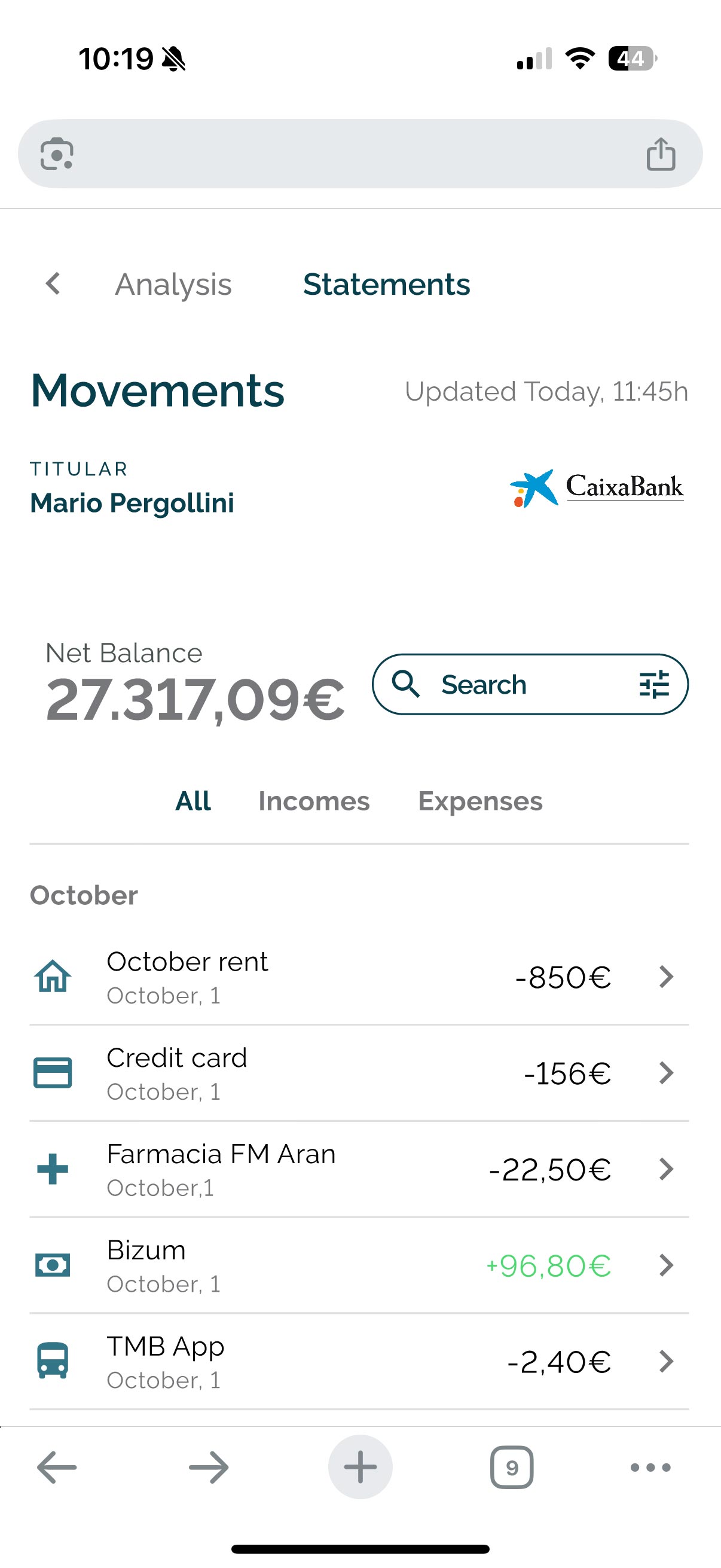
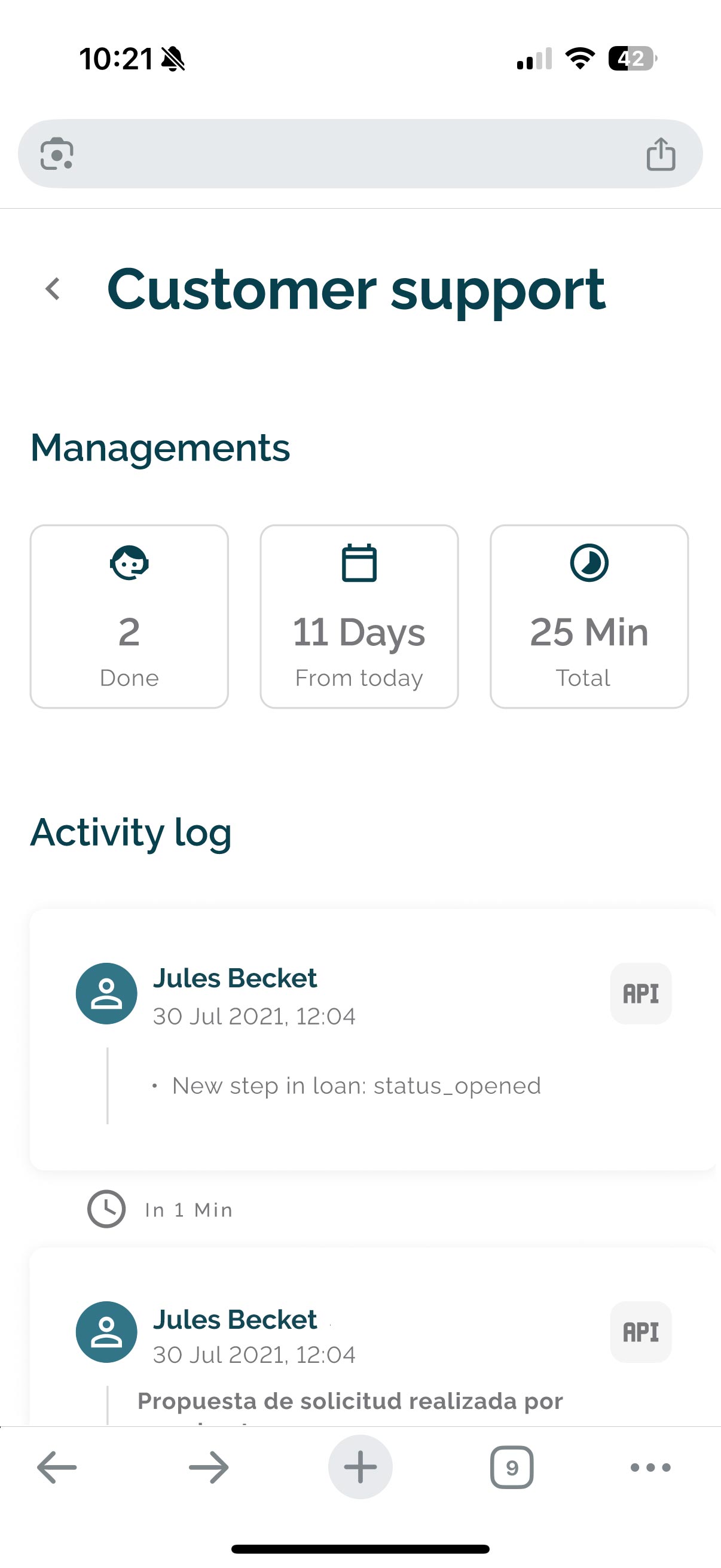
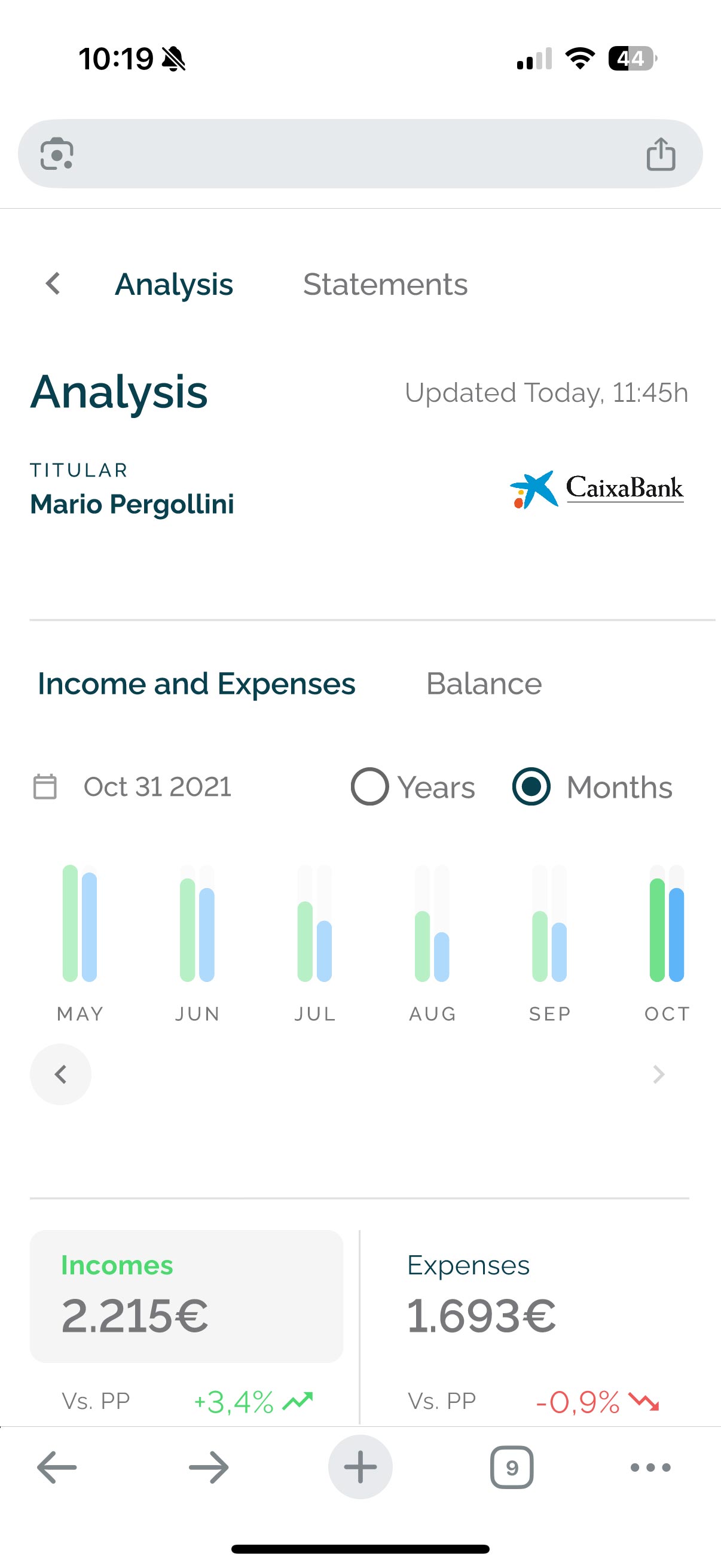
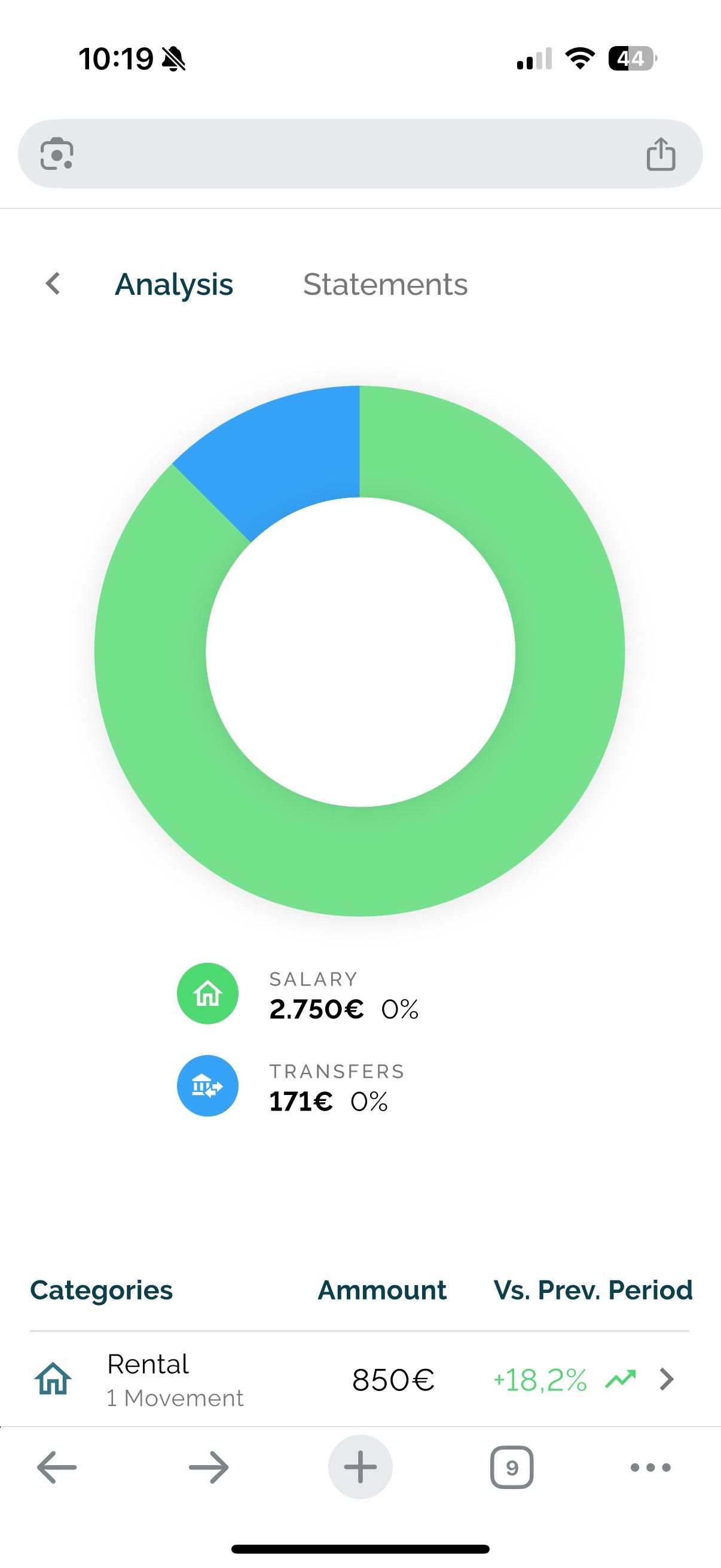
Fintech UX Patterns
Developed domain-specific patterns tailored to financial products:
multi-step loan application flows
status dashboards and system feedback
error handling and fallback states
Focused on clarity, trust, and efficiency across both customer and admin experiences.
Conclusion
This project taught me how to scale design not just across screens, but across brands and teams. Creating a white-label-ready admin panel to visualize a large ammount of financial data.
The design system pushed me to think modularly, anticipate edge cases, and advocate for scalable logic.
